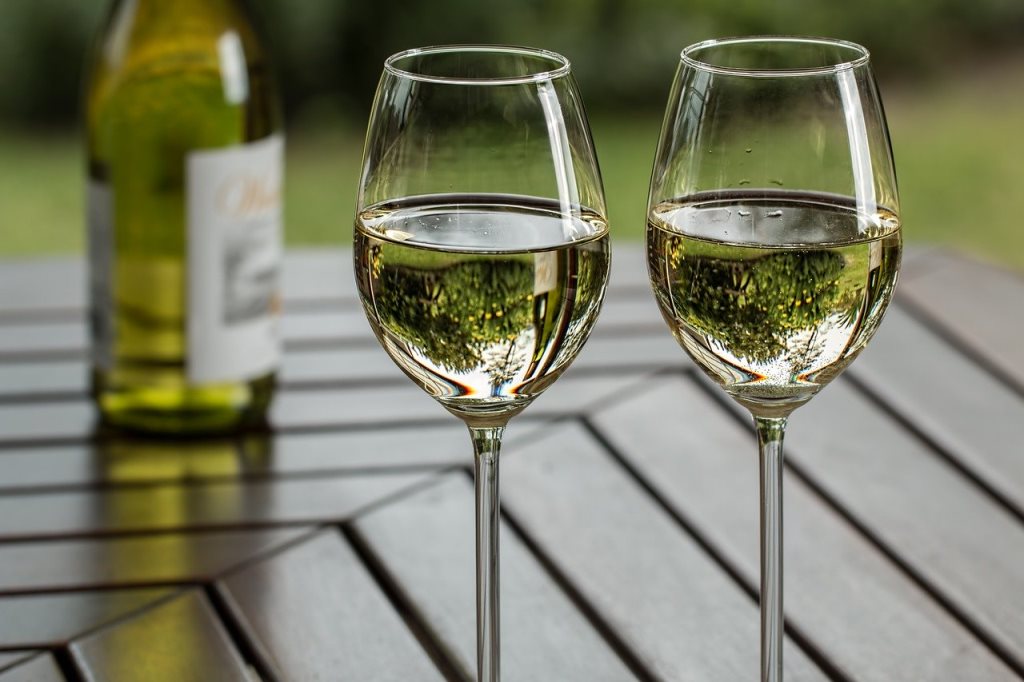
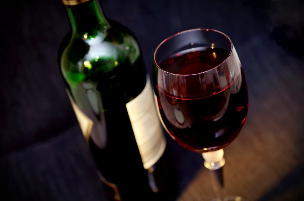
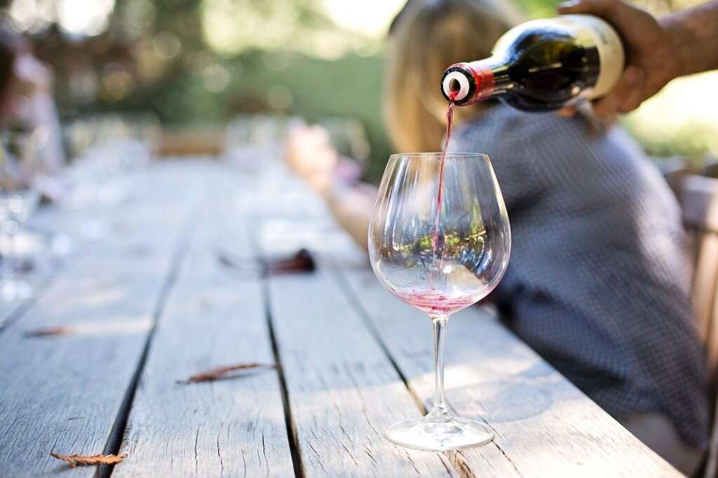
As more and more small wine producers are on the market, fighting for their place on the supermarket shelf, competition has increased many times over but a competition is also open for the most creative appearance of the bottle and label.
The basic question that designers ask when thinking about designing packaging is: why does an interesting label design influence our choice of wine and simply make us choose one bottle over another?
The profile of wine lovers changes from year to year, just as their buying habits change and evolve.
All this affects the design of the bottle.
That's why it's very it is important that the designer follows the trends in wine production, as well as what consumers like, what their interests are. It is also important to take care of a healthy environment. If the latter is the case, the brand will insist on a label that is produced from recycled materials, which will delight customers and create a lasting relationship with the brand, based on the same values.
The power of labels
For those who like to drink wine but are not connoisseurs of it, sometimes wine selection process, which he will take to his guests, can be complicated. They don't know which type to choose, which one meso or cakes go well with which wine.
This ignorance of the types of wine can easily lead to aimless wandering around the shelves in the store, which after half an hour brings even more confusion. In that moment, what makes the difference and on the basis of which the lay customer chooses a wine is precisely the label.
Seeing the luxuriously designed label and the carefully selected wine bottle, the customer comes to the conclusion (or at least hopes) that it is a quality wine, which is confirmed by its appearance.
Based on the appearance of the label, customers make a choice without much thought.
That will bring them the pleasure of a good purchase and relief that the situation with a great deal of uncertainty is over.
Wine labels can trigger emotions in the customer (which is the most important goal of every marketer) but also they can bring a certain hint of the taste of the wine, which is in the bottle. Memories of summer, a special one dinner which marked the anniversary of a marriage or the birth of a child - all these are events from the life of a customer, which can appear in his memory at a moment's notice and cause pleasant emotions.
When it comes to young people, a slightly different look of the label applies to them. Namely, the younger target group enjoys colorful and playful visuals, which are impressive and attract attention. For the slightly older population, cream or white labels with different typography, which can also have a vintage tone, are much more interesting.
No, label is not everything (although the most important element is on the bottle). In order for the customer to fully enjoy choosing a bottle of wine, the outer packaging and its appearance are important.
A dark colored bottle makes white wine much harder to sell, while a clear bottle is a pretty poor choice for a dark wine, unless the producer wants it mixed with blueberry juice. Maybe this seems like a small thing to some. However, this is not the case in the world of luxury products whose prices can reach several tens of thousands of dollars. Precisely because of who they are intended for, such expensive wines have carefully selected packaging and labels.
One study showed that as many as 94% of respondents remembered a label design that had striking graphic elements on it, compared to 68% of those who were more attached to a more classic label look.

Elements of a wine label
Colors – the human eye is much more adapted color perception, than is the case with black and white images. That's exactly why it's not bad to add colors to the labels, because they bring multi-layeredness and deepen the meaning of the use of each of them. If you want your wine brand evokes warmth or optimism, then yellow is the right choice. Blue, on the other hand, means honesty and calmness. Dark purple should be chosen by those wine brands that want their design to associate customers with royal pleasure.
Graphics – if you want your logo to be seen well even from a distance, then surely the designer should use clean, clear lines and simple shapes. Knowing that millennials prefer wines with labels that contain striking graphic elements, it is clear that they need to be bold (just like young wine lovers).
Typography - an older and somewhat more conservative target group will probably enjoy "serif" fonts much more, while "modern sans serif" is intended for the younger population.
Text and background color combination – in order to achieve a striking contrast between the letters and the background, it is important to choose the right colors. This combination is very important so that the label itself is as legible as possible, and the design is pleasing to the eye of the consumer.

Wine sales and advertising - what connects them and how they complement each other
As with many other massively popular products, their presence on the market plays a big role in how they will be presented to the public and how they will be advertised. Wines are hyper popular, there are many of them.
Especially in the last few years, since dozens of quality ones have been opened in our country domestic wineries.
This information affects that label design and wine packaging must be particularly creative, different and attention-grabbing because sales depend on it.
Of course, slightly cheaper wines are not sold in the same way for mass use, which we can buy in supermarkets and she collects something, which we can try at carefully selected places. The first group of wines must be constantly available to its consumers, and therefore the appearance of the packaging should be impressive, compact and acceptable to as many customers as possible.
Figures and metrics are quite clear when it comes to wines whose price does not exceed ten euros, but what happens when we want to sell a more luxurious wine that, compared to its quality, has a higher price?
The first thing you want buyers to think in this case is that the series of that wine is limited, that it is exclusive and that it is not available in unlimited quantities, as is the case with those of the first group. That's why the label and the bottle must have a luxurious look, typography in gold or silver color, calligraphically written name and all similar elements that remind us of wealth and luxury.
There are many different factors that lead to the decision of which wine to choose at a certain time and on a certain occasion. However, we will agree that most of all the elements, we direct our attention to the label because apart from its beautiful appearance, it also provides us with information such as the type of wine, the year of production, etc.
If you want the packaging of your product (including wine) to have a creative and professionally done look, then you should contact us talented designers, who will choose the right combination of colors, typography and elements for you.
READ: WHERE CAN I BUY THE BOOK TRADITIONAL RECIPES OF HOME SERBIAN CUISINE?
Read more:
The Recipes and Kuvar online portal is ranked among the TOP 50 websites in Serbia!
Don't miss a recipe - Recipes and cookbook online on Facebook. Stay tuned, follow the Recipes and Cookbook twitter notifications!


